So, it has been a busy summer...and a busy start to the school year! I am finally getting around to posting my next two sketchbook exchange entries. I have had the pleasure of drawing in 3 other fabulous artists' books, and I have the next one on my desk, waiting to be filled.
DRAWING #3 - August 2014
To catch you up: I decided to do my third sketchbook entry on some of the gorgeous botanicals that I see when we go to Myrtle Beach, SC: the crepe myrtle tree and the magnolia tree.
I was very pleased to have been able to cover both of these in the spread, and I kept with my favorite media, ink or ink and colored pencil.
On the upper left, you can see a close-up of the crepe myrtle (Lagerstroemia.) This is a close-up of the small, round buds that form before opening up into the frilly, tissue-paper-like blossoms. This particular tree had white blossoms, but we saw many with gorgeous, deep pink blossoms as well. Below the blossom is a sketch of the side and top views of the crepe myrtle seed pods. These dried brown pods contain six segments and look like little stars.
On the right side of the spread, I was able to include some drawings of the beautiful Magnolia grandiflorium that are so prevalent in the southern U.S. The upper right shows a cross-section of the immature magnolia seed pod. What a fun find! This has a soft, fluffy white outer covering with a velvety, dark brown stem. The lower right of the page shows the seed pod as it sits among the glossy, dark green leaves. I love the rusty brown underside of the magnolia leaves and tried my best to capture it with colored pencil.
DRAWING #4 - September 2014
For my next drawing in the sketchbook that arrived in September, I had an easy choice of subject. Upon our return from Myrtle Beach in July, I made a happy discovery in our front flower bed: a pumpkin vine was growing! This was the most inadvertent, yet successful, gardening I have ever done. I had left a large pumpkin to decay in the flower bed last winter (too lazy to get a garbage bag to put it in...) After the hard winter we had, it emerged in the spring, frozen white and starting to decay. The local squirrels had a ball tearing it apart and must have put some seeds in a good spot, since we now have a lovely pumpkin plant there!
I loved seeing the bright, orange/yellow blossoms popping up. They also shrivel beautifully as they shrink, curling into wonderful shapes. Once I saw how the pumpkins begin forming under the shriveling blossom, I decided that would be a great way to show both the fruit (in a stage not typically seen) and blossom. I also included some sketches (in graphite) of the blossoms as they begin to form, with hairy stems and beautiful, structural ribbing. These are on the right-side of the spread.
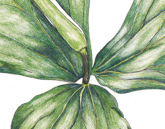
This particular journal was a bit bigger than the others so I wanted to think of something to include on the opposite page of the spread. I love the large, lobed leaves of the pumpkin plant, especially since that is mostly what you see as it grows. They start out tiny and spread into a wonderful, large green canopy covering the blossoms and fruits. This particular leaf is life-size on the page, but in life would grow to nearly twice this size.
I initially started with a graphite drawing, but decided to switch to pen using a stippling technique that allows for delicate gradations of shading. Stippling is wonderfully meditative, but it does take some time. As I was a bit behind on my timing to finish the book, I left the leaf half-completed which works well since this is a sketchbook, after all, and not a finished piece.
Finally, I added the curling tendril at the top of the page, connecting the spread. These tendrils are found all over underneath the pumpkin leaf canopy, extending from blossoms to stems and wrapping around all of the parts of the plant.
I am so excited that we are about halfway through the exchange now! I look forward to working on my next entry so stay tuned!
Showing posts with label pen and ink. Show all posts
Thursday, September 25, 2014
Saturday, September 28, 2013
Legacy of the Land Through Art Exhibit - Artwork Finished! Part I - Jack in the Pulpit
Update 11/8/13: SOLD! Thank you to the purchaser!
Update 10/11/13: Auction Site for Legacy of the Land Through Art is up!
Visit the site to view, bid on and/or purchase artwork from the exhibit!
It has been quite some time since I updated you on my pieces for the Legacy of the Land Through Art Exhibit (via Legacy Land Conservancy) coming up next month. I spent a good deal of time working on sketches this summer and ended up with two final pieces for the exhibit by the September 9th deadline. This post covers the process for finishing the first of the two, my Jack in the Pulpit portrait in ink and colored pencil.
Jack in the Pulpit is a woodland perennial that I encountered quite a bit in my forays to Creekshead Nature Preserve, my assigned project property. Creekshead is known for its spring wildflower display, and I made a number of trips out there in April, May and June to explore the area.
Ironically, due to some tight scheduling in the spring and weather-related delays, I actually missed peak bloom! Luckily, my focus is on plant portraits and details. There were still a number of individual plants blooming during my explorations that I was able to get a broad picture of what species were in the preserve and which I might want to depict on paper. Jack in the pulpit was one of the species that was present in great numbers, right alongside the trail, each time I went to the preserve. Its distinctive flower, a large, cylindrical, hooded flower with beautiful maroon/brown stripes, made it top on my list for a plant portrait.
I was able to observe and photograph the jack in the pulpit through early spring when the leaves were just starting to form and unfurl through mid-late summer when the berries were present in green, before the fall turn to bright red. I worked mainly from my photographs as my time in the field was very limited.
Studies and Sketches
Here are some of my initial sketches and studies as I began to get a feel for the plant:
Field study - sketches and notes. Graphite study from reference photos.
Color study - using Faber-Castell Polychromos colored pencils.
Composition
I struggled with what exactly to show in my finished piece. I wanted to depict the different stages of the plant as I observed it, but also wanted to show both the male and female of the species, the former with one set of three leaves, the latter with two sets of three leaves, each with one of the unique, pitcher-like flowers. I played around with sketches on tracing paper and also printed and cut out sketches so that I could move them around, trying out different layouts.

Above is a test composition that I liked as it shows the broad, mature, umbrella-like leaves above the flower, as well as the female plant and some of the early spring versions of the plant with leaves unfurling. However, I felt like the composition was hiding some of the details of each of those and I also thought that if I rendered them all in color, they might blend together too much.

Here is another composition that I felt showed the plants more clearly, but it seemed to be a bit too busy, without a clear path for the eye. I also started running out of time and with the level of detail I wanted to give each plant, I wasn't sure I could complete it by the deadline!
I worked with a local gallery, Dexter Picture Frame Company, to get both this and the other piece framed professionally for the exhibit. I chose to go with a natural wood frame, in keeping with the organic nature of the piece. I also kept the ties local by choosing a Paul Hickman frame from his Urban Ashes line which uses salvaged or deconstructed wood from here in Michigan. This is the clear cherry wood, and I thought it complimented the colors in the stem very well.
Stay tuned for Part II for details on the second piece that I completed for the exhibit!
Wednesday, December 12, 2012
A View In Color
Remember the pen and ink commission I posted a while back? It was originally done just in ink, but after consulting with the client, they decided that they preferred some color (this is for a gift and is a special place to the recipients, so they wanted to make sure it really resonates with them.)
Here is the final pen and ink:
Today, I added the colored pencil. Here is the final result:
I think it turned out beautifully! I particularly like the way the water turned out. It really makes it the focal point of the drawing.
I used my favorite Faber-Castell Polychromos pencils and layered five different colors for the water: cobalt turquoise, dark thalo green, cobalt green, ultramarine, and navy for the darkest area near the horizon.
Greens used included chrome oxide green, pine green and earth green yellowish.
Have you had any holiday commissions to complete? How are they coming along?
Saturday, November 17, 2012
A different sort of commission for me...landscape in pen and ink
I just completed my most recent commission in pen and ink. This was a little different than my normal subjects, but still an enjoyable challenge to render. As usual, this was done with my 3X0 (.25) Rapidograph pen on smooth Bristol paper.
The scene is a special one for the recipient, so a different composition was not really an option. Because the final drawing is approximately 9X12 (fairly small), I tried to focus on using various pen and ink techniques to highlight the different textures present. I did some heavy cross-hatching on the metal railing in the foreground; squiggly line work to show the foliage behind the railing; stippling to indicate sand on the beach; and various straight, fanned-out line work to fill in the palm trees.
I think it turned out very nicely and hope the recipient enjoys it!
Have you done any challenging projects lately? How did you manage to work around any tough parts?
Labels:
beach,
bristol,
commission,
landscape,
palm trees,
pen and ink,
Rapidograph
Sunday, July 29, 2012
Cat Portrait Commission - Pen and Ink
Ahhhh...how I love pen and ink! It has been some time since I have done a pet portrait, but I recently had a commission for a beautiful, Siamese cat.
I worked from photos like I normally do, but the cat itself was difficult to photograph because of the dark markings on the face and there was some glare on the photos. It was a bit challenging to render, but even so, I think it turned out very well.
The fine pen was terrific for the face, but I started to question my sanity when I began to fill in the fur on the back half of the cat, most of which was dark brown to black. It went faster than I anticipated, though, and I think the fine pen lines worked really well to captured the subtle fur patterns, rather than just filling it in as a solid black.
This is an early photo of the pencil work as I blocked in the fur markings, etc. I always make sure my pencil areas are marked in before beginning any ink. If it doesn't look right in pencil, it won't look right in ink.
The final, finished drawing.
Once I finished with the pen work, I let it dry thoroughly overnight and then took my kneaded eraser to the whole thing to remove any stray pencil marks. I think the final turned out well and hope that the owner enjoys both the cat and the drawing for many years.
Labels:
cat portrait,
fur map,
graphite,
pen and ink,
pencil,
pencil draft,
pet portrait,
Rapidograph
Tuesday, July 3, 2012
Trillium Print - Combined Composition
I recently ventured into creating my first, small, print run of my artwork to be used in a gifting event. This was for the Christmas in July gift bags, an event for the indiExhibit, which were gifted to a small group of twelve celebrities.
I have participated in events before, but never gifted a print of my artwork before. I had to keep it fairly small, as there were items from other artists in the bags also.
I knew which drawings I wanted to use - two drawings of a white trillium (Trillium grandiflorum), from sketches and reference photos taken at an art retreat last year (see my first post here.) I love wildflowers and really enjoyed getting to know some of the local ones, including the beautiful white trillium. The triangular, pointed leaves and petals really appealed to me.
I had completed one drawing in color (ink and colored pencil) of the plant in bud, and had an ink drawing of the plant flowering, so I thought it would be interesting to combine the two into a simple, botanical print. I scanned both drawings into my photo editing program and played with the composition until I felt it was right. I really wanted to showcase the full color drawing, so I wanted that in the foreground. Personally, I found it more interesting that the drawing of the plant in bud, not full flower, was emphasized. Rearranging it several times, and printing out drafts, I settled on the vertical presentation.
I added some italicized text at the bottom to identify the plant and printed it out on acid-free, white cardstock. The final, matted print was only 5x7 inches, and I thought of it as similar to a note card (not intended as an archival, fine art print) that showcases my work, but isn't expected to last 500 years. I am hoping that maybe the celebrity recipients find it to be a little piece of botanical interest that they can put in their home or give to another friend or relative who likes this style of art.
The final print in it's white mat.
Back of the print with a small printout with my contact information and information about the trillium plant itself. Might as well educate a bit while I am at it! :)
Of course, I finished the gift package by putting the print/mat/backing into a clear bag, including my business card and wrapped a little green, waxed linen thread around it with a gift tag on the front (that included my holly painting, since it was for Christmas, after all!)
It's unusual to get any direct feedback from the celebrity recipients (understandably), unless they are exceedingly gracious to each artist included in the gift bags or happen to really take to a particular artist's work. However, I love that this gave me an opportunity to "expand my horizons" (thank you, Mrs. Pletcher!) and think of how I could present my work and share a little of my artistic interests with a different audience.
Have you ever ventured out of your comfort zone or usual routine to do something different like this? I would love to hear about it!
Tuesday, May 15, 2012
House Portrait - Finished!
I have been working on a house portrait commission this spring and just completed it this morning. This is a wonderful little 1950s brick ranch house. It has a lot of great details on it that made it very fun to draw, including the garage windows, the front door glass inset, the wrought iron porch railing and house number sign, as well as the scalloped awnings over the windows.
The final portrait is only 10 x 8 inches, so it was a bit of a challenge to get the details in there accurately, but I think it turned out well. It mats up to 11 x 14, so a nice addition to the wall space of the homeowner.
Wednesday, March 7, 2012
Trillium - Done!
Here is a scan (not just a photo as I had posted before) of the final version of the trillium in ink and colored pencil:
I continued to work on the shading and dark areas with dark indigo, but most of what I did was "paint" with my kneaded eraser by lifting out areas of color where there are highlights and then doing a tiny bit of blending after that.
Here is a detail shot of the center (per Irene's request!) :) I am embarrassed at how much clean-up I need to do around the edges!! However, it is helpful indeed to see a close-up.
I really like how it turned out. Is it perfect? No, but it feels "done" to me. I don't want to compare it exactly to the reference photo, but rather just look at it on it's own merit. I know from past experience that I will set it aside and catch a glimpse of it later and continue to be very pleased with the end result.
I have a second reference photo and line drawing in ink of another trillium - this time with an open blossom. So, that will be next on my list!
What do you have on your drawing table or workbench this week?
Tuesday, March 6, 2012
Update - Trillium Almost Done!
I have been working more on the trillium and am getting closer!
This is what it looked like yesterday (above), as I continued to add layers of color on all three leaves.
And this is what it looks like today, after additional layering, mostly the olive green. I added dark
indigo (9201-157) to the mix to deepen the shadow areas and still need
to blend those in more as well as darken more, especially on the leaf on
the far right.
As I have read in many instruction books, using a dark
blue/indigo or sepia is a better way to deepen shadow areas as it
provides depth and doesn't make it as flat or stark as black.
I need to set it aside and look at it with fresh eyes later or tomorrow, pull out some highlights and further darken shadow areas, then make sure the blending works overall.
This is the part that I find most difficult and most rewarding. If it continues to come together and I can 'see the end' then it gets exciting. However, often at this stage, I find that I blend too much and it gets overworked.
Saturday, March 3, 2012
Making Progress - Trillium in Ink and Colored Pencil
I am making a bit of progress on the trillium (Trillium grandiflorum). I have continued to layer the permanent green olive (#9201-167) over the darker deep cobalt green (#9201-158) layer.
I
will continue to layer until I get all three leaves colored. Then I
will work on refining the shading, deepening shadows, lifting out
highlights, etc. Stay tuned!
What are you working on these days?
Saturday, February 25, 2012
Work-In-Progress: Trillium in Ink and Colored Pencil
Today I wanted to give you a peek of the drawing I have in-progress. Finally! A chance to get back to pencils and paper. :) I absolutely love working with my beads, but very much missed drawing.
So, I decided to be patient, get the pencils out and work on this a
little bit at a time.
I prefer working with colored pencil when adding color, so I brought out my favorite Faber-Castell Polychromos pencils. My paper is also one of my favorites, Fabriano Artistico, 140 lb, hot-press watercolor paper. This takes both the ink and the colored pencil well, so it's a great choice for these types of illustrations. This particular piece is on a 9" x 12" size sheet.
I did some test swatches on a separate sheet of paper to compare colors to the reference photo. I also wanted to start with the darkest shadow areas, and decided that a base layer of deep cobalt green (#9201-158) would be best. This is more of a blue-green, and you can see the areas where that is the first layer.
On top of that, I began layering permanent green olive (#9201-167). Again, you can see where I started adding that and how it begins to bring more depth to the shaded areas.
I have a few other greens that I will layer in as I go, including pine green (#9201-267), may green (#9201-170) and earth green (#9201-172).
Here is the drawing with the reference photo so that you can see what I am working with:
The key for any colored pencil drawing like this is PATIENCE!! I tend to want to get it done in the limited time I have to work on something, but end up rushing it and not taking my time to really layer properly.
The other important key in colored pencil work is a *sharp pencil point*. This is emphasized over and over in all of the drawing books I have, particularly on botanical illustration. A sharp point allows you to blend layers of color more smoothly and create the details needed without making it flat. This all combines to create a richer drawing with depth and detail.
Do you work with colored pencil? What do you like best about the medium? What is the most frustrating for you?
Wish me patience and sharp points and I will keep you posted on my progress!
Saturday, December 24, 2011
Merry Christmas!
I just wanted to take a moment to wish all of my readers a very Merry Christmas and Happy Holidays!
I thank you all for following along and for all of your comments, which I so enjoy reading. I look forward to having you join me for a new year full of artistic adventures!
Ink and colored pencil study of my Christmas cactus.
Tuesday, November 15, 2011
House Portrait - Finished!
I have completed another house portrait in pen and ink!
This was done on smooth Bristol with my 3x0 (.25) width Rapidograph pen. The drawing is 10 x 8 inches and will mat up to 14 x 11 and fit into a standard frame. I like working with the thinner pen width as I feel it gives me a little more control, especially with the size of the drawing.
This one is for a friend and her family who are building a new home at the same site. Her children, especially her youngest, expressed 'missing the old house' as they await moving into the new one, so I thought it would be a nice little memento to have of the original home. I worked from a photo of the house early-demolition, so I hope that it comes close to the original!
I hope to deliver it either in person or via mail over Thanksgiving. They may actually be close to moving into the new home then as well, so the timing is good!
Wednesday, November 9, 2011
Fabric Fun! More on Spoonflower...
I have been having some fun on Spoonflower again :)
I am practicing creating better repeats in my patterns and have two new ones to show you:
This one features my new autumn leaf drawing. See the other leaf designs, which are in my Trees collection!
Also, I have been playing around with my graphite drawing of Orange Star blossoms and created a 'ditsy' or scattered print:
Check out the rest of the Orange Star designs!
Labels:
autumn,
blossom,
colored pencil,
ditsy print,
fabric,
flower,
graphite,
leaf,
Orange Star,
pattern repeats,
pen and ink,
spoonflower
Friday, November 4, 2011
A Beautiful Fall Leaf!
Finally, some new artwork! I had a rare opportunity this afternoon - toddler was napping and my older daughter and her friend were out in the yard playing on this gorgeous, fall day. They were bringing me leaves and this little gem was in the stash.
I haven't looked up what tree this is from - any ideas?
I was able to do an ink and colored pencil drawing on Fabriano Artistico (extra white) 140 lb hot press watercolor paper. I used my Faber Castell Polychromos pencils.
I really love the green and yellow mottling in the center and the rich reds throughout the leaf. Glad I drew it as soon as they brought it in as it's already mostly brown and the vibrant colors have faded.
What fun, autumn arts and crafts have you been up to lately?
Thursday, September 8, 2011
Broccoli Leaf - Ink and Colored Pencil - Advice?
I am working on a broccoli leaf in ink and colored pencil, but am having trouble with the color.
The leaf is actually sort of bluish-gray/green with an almost chalky look to it. I can't seem to find any pencils in my current stash to render it correctly. I am using Faber Castell Polychromos and so far on this have used light green, permanent green olive and chrome green oxide.
I have many layers to go yet, but this shows you the initial stages of shading. The stem and underside of this particular leaf were more in the sun and do indeed have a yellow-green hue, but the top part of the leaf is almost a white-gray-blue-green. I am trying to figure out what colors to use in addition to how best to layer them. It will take some experimenting, for sure! And perhaps a purchase of some additional pencils.
Do you have any advice on how to get the blend of colors right? I'd love to hear from you!
I will keep plugging away and post more in-progress updates as they develop. Thanks!
Labels:
botanical illustration,
broccoli,
colored pencil,
drawing,
illustration,
leaf,
pen and ink
Need Your Vote in the Bird Fabric Contest!
Spoonflower hosts a number of design contests and this week's is for a palette-limited bird design. Three colors were set by Spoonflower and a fourth color was chosen by the artist.
I altered the colors and arrangement of my Japanese Crane drawing to meet the design requirements and entered it!
Here is what it looks like:
I would love to have a vote for my design if you are so-inclined! See the 'Vote for Bird Fabrics' link at the end of this post.
You can vote for as many fabrics as you want, so feel
free to browse through all of the entries and click away at the ones you like. You can vote through next Wednesday evening and the results will appear on Thursday, September 15th. Thanks and happy bird-browsing!
Labels:
birds,
colored pencil,
contest,
fabric,
illustration,
Japanese cranes,
pen and ink,
spoonflower
Monday, August 1, 2011
In honor of Shark Week!
Guess what? It's Shark Week! The annual Discovery Channel special features new shows about this fascinating animal. I am not a big water person, but for some reason, I just love Shark Week.
Spoonflower, perhaps not coincidentally, is having a Sharks-themed design contest with submissions ending tomorrow 8/2. Rather than go with a typical full-body shark or silhouette, I decided it might be fun to focus on teeth instead.
Check out the Spoonflower contests page later this week to vote for your favorite shark design!
Labels:
colored pencil,
drawing,
fossil teeth,
fossils,
illustration,
megalodon,
pen and ink,
Shark Week,
sharks,
teeth
Sunday, July 31, 2011
House Portrait in pen and ink - another finished!
I have completed my most recent house portrait commission that I showed you in-progress earlier this month. The final turned out very well, I think. It is approximately 10 x 8 inches and was rendered with a 3X0 (.25) Rapidograph technical pen on smooth Bristol paper (100 lb.)
I have one more house portrait to start on and then I think I will be working on some more botanicals. But you never know what might catch my eye in between, so stay tuned!
Labels:
drawing,
house portrait,
illustration,
landscaping,
pen and ink
Tuesday, July 26, 2011
The Feather - In Progress
I took several photos of the small feather during my drawing process. As I mentioned before, this was a fairly quick drawing (spent maybe a 1/2 hour, interrupted several times by the kids!), so it definitely could have been done more carefully. I was so excited to find it that I didn't want to let the opportunity to draw it pass, so I accomplished what I could in the time I had.
My initial graphite sketch.
This looks more delicate and perhaps I should have stayed with a graphite drawing to capture the downy aspects at the bottom of the feather.
Ink drawing.
You can see I got a little messy with the pen work on the dark spot on the left. I should have stopped further from the center shaft. I used a 3x0 (.25) Rapidograph pen (the smallest size I have) and it still looks too heavy to me.
Perhaps I should have put less lines down and just hinted at the structure more rather than trying to draw all of it in. It's a learning process!
Final colored pencil drawing.
You can tell this photo was taken in natural light by the window. The feather looks much whiter at the bottom. In person, that area is more gray and the photos of the previous stages above are more accurate, I think.
I used my Faber-Castell Polychromos pencils: walnut brown for the dark spots, raw umber and burnt sienna for the lighter brown areas, layered with some warm grey V and warm grey II.
Have you ever had done any feather drawings? How do you keep the delicate nature of the drawing intact, even when using ink? I would love to hear about your experiences!
Labels:
colored pencil,
drawing,
feather,
graphite,
illustration,
pen and ink,
small bird,
work-in-progress
Subscribe to:
Posts (Atom)