Showing posts with label Trillium grandiflorum. Show all posts

Tuesday, July 3, 2012

Trillium Print - Combined Composition

I recently ventured into creating my first, small, print run of my artwork to be used in a gifting event. This was for the Christmas in July gift bags, an event for the indiExhibit, which were gifted to a small group of twelve celebrities.


I have participated in events before, but never gifted a print of my artwork before. I had to keep it fairly small, as there were items from other artists in the bags also.


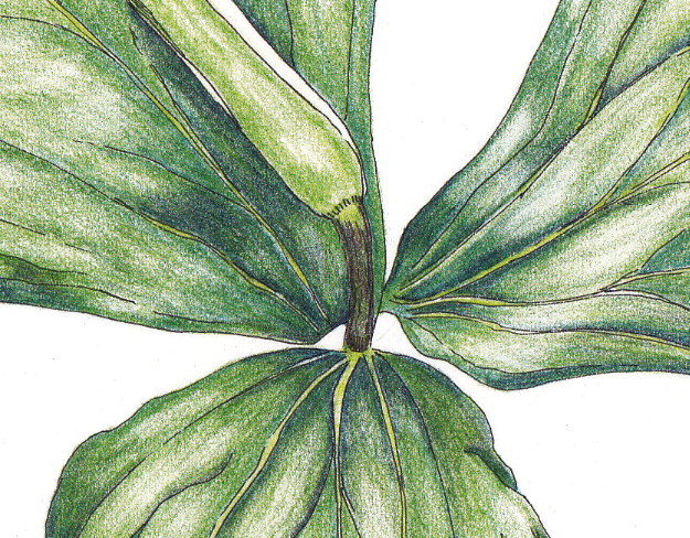
I knew which drawings I wanted to use - two drawings of a white trillium (Trillium grandiflorum), from sketches and reference photos taken at an art retreat last year (see my first post here.) I love wildflowers and really enjoyed getting to know some of the local ones, including the beautiful white trillium. The triangular, pointed leaves and petals really appealed to me. 


I had completed one drawing in color (ink and colored pencil) of the plant in bud, and had an ink drawing of the plant flowering, so I thought it would be interesting to combine the two into a simple, botanical print. I scanned both drawings into my photo editing program and played with the composition until I felt it was right.  I really wanted to showcase the full color drawing, so I wanted that in the foreground. Personally, I found it more interesting that the drawing of the plant in bud, not full flower, was emphasized.  Rearranging it several times, and printing out drafts, I settled on the vertical presentation. 


I added some italicized text at the bottom to identify the plant and printed it out on acid-free, white cardstock. The final, matted print was only 5x7 inches, and I thought of it as similar to a note card (not intended as an archival, fine art print) that showcases my work, but isn't expected to last 500 years. I am hoping that maybe the celebrity recipients find it to be a little piece of botanical interest that they can put in their home or give to another friend or relative who likes this style of art.


The final print in it's white mat.


Back of the print with a small printout with my contact information and information about the trillium plant itself. Might as well educate a bit while I am at it! :)


Of course, I finished the gift package by putting the print/mat/backing into a clear bag, including my business card and wrapped a little green, waxed linen thread around it with a gift tag on the front (that included my holly painting, since it was for Christmas, after all!) 


It's unusual to get any direct feedback from the celebrity recipients (understandably), unless they are exceedingly gracious to each artist included in the gift bags or happen to really take to a particular artist's work. However, I love that this gave me an opportunity to "expand my horizons" (thank you, Mrs. Pletcher!) and think of how I could present my work and share a little of my artistic interests with a different audience.

Have you ever ventured out of your comfort zone or usual routine to do something different like this? I would love to hear about it!

Wednesday, March 7, 2012

Trillium - Done!

Here is a scan (not just a photo as I had posted before) of the final version of the trillium in ink and colored pencil:


I continued to work on the shading and dark areas with dark indigo, but most of what I did was "paint" with my kneaded eraser by lifting out areas of color where there are highlights and then doing a tiny bit of blending after that.

Here is a detail shot of the center (per Irene's request!) :) I am embarrassed at how much clean-up I need to do around the edges!! However, it is helpful indeed to see a close-up.


I really like how it turned out. Is it perfect? No, but it feels "done" to me. I don't want to compare it exactly to the reference photo, but rather just look at it on it's own merit. I know from past experience that I will set it aside and catch a glimpse of it later and continue to be very pleased with the end result.

I have a second reference photo and line drawing in ink of another trillium - this time with an open blossom. So, that will be next on my list!

What do you have on your drawing table or workbench this week?

Tuesday, March 6, 2012

Update - Trillium Almost Done!

I have been working more on the trillium and am getting closer! 


This is what it looked like yesterday (above), as I continued to add layers of color on all three leaves.


And this is what it looks like today, after additional layering, mostly the olive green. I added dark indigo (9201-157) to the mix to deepen the shadow areas and still need to blend those in more as well as darken more, especially on the leaf on the far right. 

As I have read in many instruction books, using a dark blue/indigo or sepia is a better way to deepen shadow areas as it provides depth and doesn't make it as flat or stark as black.

I need to set it aside and look at it with fresh eyes later or tomorrow, pull out some highlights and further darken shadow areas, then make sure the blending works overall.

This is the part that I find most difficult and most rewarding. If it continues to come together and I can 'see the end' then it gets exciting. However, often at this stage, I find that I blend too much and it gets overworked.

What do you find to be the most difficult part of a painting or drawing?

Saturday, March 3, 2012

Making Progress - Trillium in Ink and Colored Pencil


I am making a bit of progress on the trillium (Trillium grandiflorum). I have continued to layer the permanent green olive (#9201-167) over the darker deep cobalt green (#9201-158) layer. 


I will continue to layer until I get all three leaves colored. Then I will work on refining the shading, deepening shadows, lifting out highlights, etc. Stay tuned!  

What are you working on these days?


Saturday, February 25, 2012

Work-In-Progress: Trillium in Ink and Colored Pencil

Today I wanted to give you a peek of the drawing I have in-progress. Finally! A chance to get back to pencils and paper. :) I absolutely love working with my beads, but very much missed drawing. So, I decided to be patient, get the pencils out and work on this a little bit at a time.
 
What am I working on? A wildflower illustration! I created two ink drawings of white trillium (Trillium grandiflorum) from reference photos taken while on a wonderful weekend art retreat to Pierce Cedar Creek Institute in Hastings, MI last spring. (You can read my posts about the retreat for details.) I wanted to start adding color to one of them. 

I prefer working with colored pencil when adding color, so I brought out my favorite Faber-Castell Polychromos pencils. My paper is also one of my favorites, Fabriano Artistico, 140 lb, hot-press watercolor paper. This takes both the ink and the colored pencil well, so it's a great choice for these types of illustrations. This particular piece is on a 9" x 12" size sheet.
 

I did some test swatches on a separate sheet of paper to compare colors to the reference photo. I also wanted to start with the darkest shadow areas, and decided that a base layer of deep cobalt green (#9201-158) would be best. This is more of a blue-green, and you can see the areas where that is the first layer.


On top of that, I began layering permanent green olive (#9201-167). Again, you can see where I started adding that and how it begins to bring more depth to the shaded areas.

I have a few other greens that I will layer in as I go, including pine green (#9201-267), may green (#9201-170) and earth green (#9201-172).

Here is the drawing with the reference photo so that you can see what I am working with:


The key for any colored pencil drawing like this is PATIENCE!! I tend to want to get it done in the limited time I have to work on something, but end up rushing it and not taking my time to really layer properly. 

The other important key in colored pencil work is a *sharp pencil point*. This is emphasized over and over in all of the drawing books I have, particularly on botanical illustration. A sharp point allows you to blend layers of color more smoothly and create the details needed without making it flat. This all combines to create a richer drawing with depth and detail.

Do you work with colored pencil? What do you like best about the medium? What is the most frustrating for you?

Wish me patience and sharp points and I will keep you posted on my progress!
Related Posts Plugin for WordPress, Blogger...