Showing posts with label Faber-Castell Polychromos. Show all posts

Sunday, February 22, 2015

Sketchbook Exchange Update - Drawing #5!

It has been quite a while since I have last posted! The fall season leading into the holidays became quite busy and next thing you know, we are here in February!

Just before things ramped up in late fall, I did finish drawing #5 for the sketchbook exchange. I was not sure what to draw since plant life outside was disappearing due to colder weather. Happily, one cool, rainy fall day, my older daughter spotted a very rare find right in our driveway! We had arrived home after school and the kids ran outside for a few minutes to play in the rain. My daughter came in to tell me she found a lizard. I really thought she must be mistaken, but followed outside to take a closer look. What I thought was a clump of wet leaves was actually a salamander!

It was very patient (trying to hide, no doubt, by staying still) while we looked at it for nearly 10 minutes. I took a number of reference photos with my cell phone so we could look it up later. Finally, it scurried up the driveway and burrowed down into the mulch of our flower bed.

We went back inside, and I started to do some research based on the markings it had. It was about 6-7 inches long, dark gray in color with white/light gray markings along the side. What I thought was a rare enough find (first salamander we had seen in our yard in 7 years) was even more rare - this was a small-mouthed salamander (Ambystoma texanum), which is endangered here in Michigan!

Needless to say, I decided that I *had* to draw this for the sketchbook! With the color, I debated doing this just in graphite, but finally decided to choose a range of colored pencils, including cold grey I, V and VI as well as some dark indigo for a little more depth in the darker areas (all Faber-Castell Polychromos.)


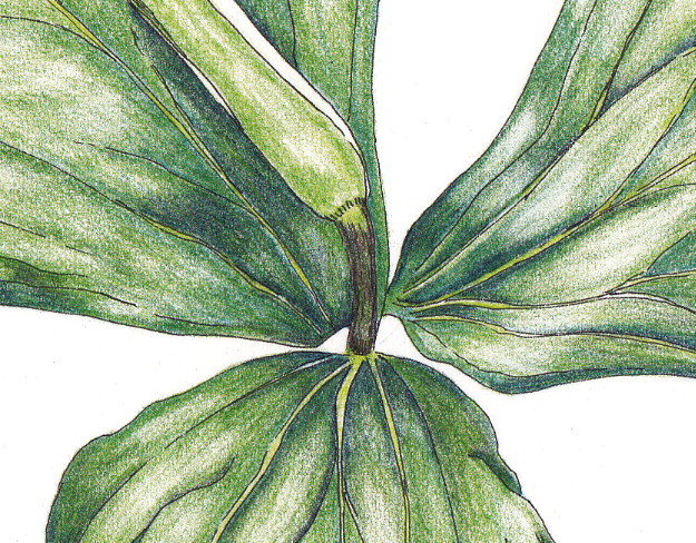
Since it took me a while to find something I wanted to draw, I was a bit behind in shipping this out to the next participant. I had wanted to include some autumn leaves, but didn't have time to draw them properly. Then I remembered some leaves I had drawn last year. I dug around and found the ones I wanted and cut them out to include on the opposite page from the salamander. Done!


I love the challenge that each sketchbook presents, depending on what season it is when it arrives, what my personal schedule will allow, what inspires me. I really enjoy that moment when I find something that speaks to me and compels me to just open the book and get started! Art in action :)

Tuesday, April 30, 2013

Mixed media experiment - tulip study in watercolor and colored pencil

I have some gorgeous red and yellow tulips in a vase this week. One of my very favorite flowers, I have always wanted to draw them, but get intimidated by the feathery red that blends into the yellow on the petals. I tend to use colored pencil and sometimes get too heavy-handed with it. I often end up with a muddy mix, rather than a delicate layering.


Clearly, I could practice just using a lighter touch and sharper pencils! However, today I wanted to try out a little mixed media technique and lay down a watercolor wash to give me some background on top of which to add pencil.

One of my retreat friends used this technique beautifully this weekend while painting a skunk cabbage in all of its maroon and cream glory. It reminded me that although I have not done much painting with watercolor, I could definitely use it as a base for a detailed colored pencil drawing, especially when layering very light colors with darker ones.

I started out with a light graphite pencil sketch to get the shapes. I have a small Windsor & Newton travel watercolor kit and used one of my travel watercolor brushes to grab a little bit of yellow and do a light wash on the petals. I also did the same with a light wash of green on the stem and leaves.


I painted on Fabriano Artistico Extra White hot press watercolor paper. I took some quick snapshots to show the process, but apologize for the poor quality of the photos! It should give you an idea of how I worked through the study, at least.

Next, I started adding in layers of colored pencil. I use Faber-Castell Polychromos pencils. For this particular study, I used dark red for the deepest shadows in the petals and layered deep scarlet red and pale geranium lake on top for the red sections. For the yellow, I added some shadows with light yellow ochre and dark naples ochre. I kept layering, attempting to capture the subtle texture of these silky petals.


I used light green, permanent green, may green, and pine green for the leaves and stem. 

As you can see below in the photo of my whole page, I did some test patches for each pencil before I used them to make sure I had the right colors. I need to do a color chart of all of my pencils to use as a reference! Those can be fun to make and good pencil practice - perhaps another blog post?


When I finished, I set the drawing aside for a few minutes and came back to it, darkening some shadows for definition and adding some highlights with my kneaded eraser. Here is the final. It's a photo (couldn't get the scan to look right) and even this doesn't quite show the darker reds as much as the actual.


Overall, I really liked using a watercolor wash as a base. I have more practicing to do, but look forward to using this technique again. 

Do you use mixed media in your work? What combinations do you like and why?


Wednesday, December 12, 2012

A View In Color

Remember the pen and ink commission I posted a while back? It was originally done just in ink, but after consulting with the client, they decided that they preferred some color (this is for a gift and is a special place to the recipients, so they wanted to make sure it really resonates with them.)

Here is the final pen and ink:


Today, I added the colored pencil. Here is the final result:


I think it turned out beautifully! I particularly like the way the water turned out. It really makes it the focal point of the drawing.

I used my favorite Faber-Castell Polychromos pencils and layered five different colors for the water: cobalt turquoise, dark thalo green, cobalt green, ultramarine, and navy for the darkest area near the horizon.

Greens used included chrome oxide green, pine green and earth green yellowish.

Have you had any holiday commissions to complete? How are they coming along?


Wednesday, March 7, 2012

Trillium - Done!

Here is a scan (not just a photo as I had posted before) of the final version of the trillium in ink and colored pencil:


I continued to work on the shading and dark areas with dark indigo, but most of what I did was "paint" with my kneaded eraser by lifting out areas of color where there are highlights and then doing a tiny bit of blending after that.

Here is a detail shot of the center (per Irene's request!) :) I am embarrassed at how much clean-up I need to do around the edges!! However, it is helpful indeed to see a close-up.


I really like how it turned out. Is it perfect? No, but it feels "done" to me. I don't want to compare it exactly to the reference photo, but rather just look at it on it's own merit. I know from past experience that I will set it aside and catch a glimpse of it later and continue to be very pleased with the end result.

I have a second reference photo and line drawing in ink of another trillium - this time with an open blossom. So, that will be next on my list!

What do you have on your drawing table or workbench this week?

Tuesday, March 6, 2012

Update - Trillium Almost Done!

I have been working more on the trillium and am getting closer! 


This is what it looked like yesterday (above), as I continued to add layers of color on all three leaves.


And this is what it looks like today, after additional layering, mostly the olive green. I added dark indigo (9201-157) to the mix to deepen the shadow areas and still need to blend those in more as well as darken more, especially on the leaf on the far right. 

As I have read in many instruction books, using a dark blue/indigo or sepia is a better way to deepen shadow areas as it provides depth and doesn't make it as flat or stark as black.

I need to set it aside and look at it with fresh eyes later or tomorrow, pull out some highlights and further darken shadow areas, then make sure the blending works overall.

This is the part that I find most difficult and most rewarding. If it continues to come together and I can 'see the end' then it gets exciting. However, often at this stage, I find that I blend too much and it gets overworked.

What do you find to be the most difficult part of a painting or drawing?

Saturday, March 3, 2012

Making Progress - Trillium in Ink and Colored Pencil


I am making a bit of progress on the trillium (Trillium grandiflorum). I have continued to layer the permanent green olive (#9201-167) over the darker deep cobalt green (#9201-158) layer. 


I will continue to layer until I get all three leaves colored. Then I will work on refining the shading, deepening shadows, lifting out highlights, etc. Stay tuned!  

What are you working on these days?


Monday, March 28, 2011

Japanese Iris Blossom - Ink and Colored Pencil


Happy Monday! I had a chance to work on and finish this drawing of a Japanese Iris blossom. I had bought a small bunch at the store a few weeks ago and had done some sketching at the time. I finally had an opportunity to add color to the blossom sketch last night. I just love these particular iris with the bright yellow midrib and delicate, draping blossoms. So beautiful!

I completed this with my usual array of Faber-Castell Polychromos pencils on smooth bristol paper, doing some basic pen work with my Rapidograph 3X0 (.25) pen. Interestingly, the center part of the blossom that was still closed in this view really is a darker, more reddish-purple color than the lighter blue-purple outer petals.

As you can tell from my posts, I really like iris and daffodil! I also really love tulips, but haven't done much drawing of them. What are some of your favorite spring flowers?

Tuesday, January 11, 2011

Garlic Scapes - ink and colored pencil

I finally had a chance to do a color version of my garlic scapes drawing from last year. This was done in pen and ink and colored pencil and the image is about 5 1/2 inches wide by 6 1/2 inches high. I did the pen work first, using my Rapidograph 3x0 (.25) size nib. I really like the fine line that I get with this size and think it works well when adding color with pencil later. I did do a thicker trace over the outer edge of the stems so it reflects a slightly larger pen size. In the original ink drawing, I had used a size 0 (.35) nib for the stem outline.

For the colored pencil, I used Faber-Castell Polychromos pencils, layering permanent green olive (9201-167) first on the stems, then adding pine green (9201-267), darkening the edges for some form/shadow. I used a light wash of earth green yellowish (9201-168) on the bulbs and some on the stems as well in the lighter areas. Finally, I added some chrome green opaque (9201-174) to darken the stems (they are kind of darker/duller in real life) and then burnished with ivory (9201-103) over the whole thing to blend everything together and dull some of the brighter areas. I think it turned out pretty well and it's fun to finally see it in color!
Related Posts Plugin for WordPress, Blogger...