Showing posts with label botanical art. Show all posts

Thursday, July 30, 2015

Etsy Shop Update -- Need your help!

I am making plans to update my inventory in the CCreech Studio Etsy shop and need your help! 


What do you want to see there? More artwork? More bracelets or earrings? Certain stones? Or, less of something? Let me know what you think! 

Check out my current offerings here: https://www.etsy.com/shop/ccreechstudio

Comment with your suggestions and receive a surprise discount coupon code to use on anything in the shop as a thank you!

Sunday, July 19, 2015

Sketchbook Exchange - Drawings #6 and #7 and my own book back!

It has been a busy time! I last posted in March and we are now to mid-July! In those four months, I  have completed the final two drawings for the sketchbook exchange project that I have been a part of for the past year.

I also moved houses and went on vacation, so I was thrilled, upon my return, to find my own sketchbook back from its last stop in Singapore, filled with amazing artwork from around the world!

Here is a peek at some pictures of the gorgeous pieces that fill my sketchbook from seven amazing artists. From left to right (starting in the top left corner): Linda Trella, Giulia Canevari, Elaine Moore Mackey, Beryl Prout (two pages), Mischa (two pages), Sevil Medhi, and Teo Nam Siang.


Previous to getting my own book back, I finished up drawings for Giulia's and Linda's books.

For Guilia's, I did some ink and colored pencil drawings of the beautiful chive blossoms that were popping up in my old garden. I also found some neat seed hyacinth seed pods to round out the other page (graphite, ink and ink/colored pencil.) I was anxious to get this mailed out before our move and was glad to get it finished.


Linda's book was carefully packed in my bag so I wouldn't lose it. Once we were settled in a bit at the new place, I was able to do some drawings of iris buds that I had from my old garden and then found the perfect finishing touch at the new place once my hostas started blooming. I used ink and colored pencil on the hostas, colored pencil alone on the one iris bud and graphite alone on the other iris bud. Happily, I was able to mail this out to Linda before vacation.


A modified group of us (depending on availability, etc.) plan to continue the exchange for a second round starting in August, so stay tuned!

Sunday, March 29, 2015

Sketchbook Exchange Update - Drawing #6!

Over the holidays, I saw a beautiful helleborus plant and decided to bring it home. Despite being called the Christmas Rose or Lenten Rose, hellebores are not closely related to the rose family. Instead, they are an evergreen perennial flowering plant in the family Ranunculaceae.

This particular plant had beautiful, creamy white blossoms with a tight cluster of stamens in the center that open up as the bud flowers. With thick stems that have a red/brown markings and large, serrated leaves, they make a striking addition to the table. I thought it would make a great subject for my next sketchbook entry.

I started with some rough graphite sketches to get a sense of the shapes of both open petals and buds. I did a little bit of sketching of the leaves as well. The biggest challenge, though, was the center of each blossom with up to 150 stamen surrounding the pistil.

I took many reference photos, especially close-ups of the open blossoms. This proved fortuitous as I inadvertently over-watered my beautiful plant and it did not survive! So, between my sketches and photos, I was able to create this sketchbook entry:


I still love the combination of ink and colored pencil, so I went over my initial pencil sketches with a 3x0 (.25) technical pen, adding some details here and there. Then I also used my Faber-Castell Polychromos colored pencils to add color to the page on the left. I think the page turned out well.

I am currently looking for a subject for the sketchbook that I have on my desk. Wish me luck!

Wednesday, July 23, 2014

Sketchbook Exchange Update - Drawing #2!

The sketchbook exchange is off to a wonderful start! I posted about my own sketchbook a few weeks ago. After mailing mine out to the next artist, I waited for the one being sent to me from our fellow participant in Singapore.

It arrived and contained a stunning painting of the nutmeg, both the nut and the leaves, along with wonderful notes about the plant. Now I had to think of something to add to this beautiful book!

I decided to go with a study of a wild gladiolus that I happened to find in my front flower bed. I did not plant it myself, so my guess is that a squirrel or chipmunk may have transplanted it for me from elsewhere? Regardless, it was a beautiful find. I loved the curve of the stems, leaves and purple/pink blossoms. 
 
I started with some sketches on a separate sheet to get a sense of the plant and what I wanted to emphasize. I also took a lot of reference photos from every angle. 

Eventually, the plant left in the flower bed also produced gnarly little seed pods where the blossoms had been, so I was able to take one off and dissect it to include in the sketchbook. I decided to go with my favorite combination of media for the sketchbook - ink and colored pencil.


I added some notes about the plant as well as color swatches of the pencils I used to finish off the study.

I am looking forward to receiving the next sketchbook and have some ideas in mind from my recent vacation to South Carolina...some magnolia studies, slash pine cones, or perhaps crepe myrtle? Stay tuned!

Saturday, June 14, 2014

International Sketchbook Exchange!

It has been forever since I posted last! Happily, I have been busy with some different projects and finally have something to post about. 

I belong to two fantastic groups on Facebook for botanical artists: Botanical Art for Beginners and Botanical Artists. Both contain artists from all over the world who share a common interest in and passion for botanical art and illustration. 

Earlier this year, a subset of artists decided to start an international sketchbook exchange, inspired by a similar endeavor by other artists in the group last year. I was thrilled to be invited to participate! 

There are 9 of us total, spanning the globe from here in the U.S. to Ireland, Italy, the UK, Austria, Turkey, and Singapore. We all agreed to purchase the same type of sketchbook, Stillman and Birn's hardbound sketchbook from the Zeta series in A5 size (approx. 5.5 x 8.5 inches.) The Zeta series contains 180lb paper suitable for both wet and dry media, but most importantly, it opens up to lay flat, so one can work on a spread of two pages fairly easily.


Initially, we thought we would stick to just botanical subject matter, but agreed that if inspiration struck differently, we could feel free to include other natural subjects or artistic interpretations (e.g., some of the artists do motif work or other ethnic design work.) We also agreed that we would do a minimum of one, two-page spread and maximum of two, two-page spreads.


Each of us started our sketchbooks with some sort of decorated title page and then created some art to open the book. I decided to go ahead and cover my sketchbook with a nice Italian book cloth and pasted endpapers of a beautiful handmade paper from my favorite store, Hollander's. 
 

I started with a title page that included our group name, Nature Miscellany - A Sketchbook Exchange and space at the top for each artist to write their name. 

Since this is an international effort, I wanted to include something about where my book is coming from, so I drew an outline of the state of Michigan and added a couple of small botanicals: the state tree, the eastern white pine, and the state flower, the apple blossom.


I began working on the sketchbook during the frenzy of spring wildflower season, so I did a two-page spread of graphite sketches of the nodding trillium and bloodroot, two species that I had specifically hunted for in the woods this season. 


I saved the second two-page spread for a wildflower that I have wanted to draw for several years: the yellow trout-lily. The mottled leaves, resembling trout, and graceful, curving blossoms are a treat to find all over the forest floor in early spring.


I mailed my sketchbook out for our first round of exchange last week. We are mailing east, and I am excitedly awaiting the arrival of our Singapore artist's book soon!

Each of us will then have about a month to do a sketch in the book we received and mail it on in the exchange. It should take roughly a year to complete all the books, and we will have a wonderful treasure filled with beautiful artwork from artists around the world! 

Stay tuned for posts on my latest sketchbook entries!


Monday, March 3, 2014

Sketches and a new piece

Happy March! It's been a long, cold winter, to say the least! I know we are not quite done with it yet here in Michigan, but it helps to be starting a new month, that much closer to spring.

Although I have not done any great quantities of drawing or big projects this winter, I have been keeping my pencils warmed up with sketches here and there.

Below are some studies of a pretty little African violet that I picked up at the store a few weeks ago. The petals are a beautiful purple/violet color with frilled, white edges. I started with pencil sketches using my 4H pencil for a lighter touch:


Such graceful, curving stems! Then I moved on to a more detailed study in ink and colored pencil. I enjoyed rendering the overlapping petals and you can see the variety of blues and violets I chose to layer to get the correct color. The view from behind the flower (on the right) allowed the light to shine through the petals more, so the coloring was slightly brighter and lighter. All of the stems and buds are covered with tiny, fine hairs which I indicated in pen.


Finally, I have started to work on new piece, which I hope will be a finished one, probably in ink and colored pencil. This will be the Spring Beauty wildflower that I have sketched and photographed in detail before. I am trying to decide on composition, but definitely want to include the opened flowers as well as the clustered buds that hang gracefully off of the main stem. 

I actually like this simple composition below, but may want to include some overlapping elements as these tiny flowers intertwine and carpet the forest floor each spring. Stay tuned for more on this one!


Wednesday, January 8, 2014

Back to Drawing! Powder Puff Tree (Calliandra haematocephala)

Happy New Year, all!

We have had a bit of an extended winter/holiday break from school since the polar vortex arrived here in Michigan. However, things are starting to thaw out and we will be back on schedule soon.

One bonus of the extra time was having the opportunity to get back into drawing after the holidays. Right before our most recent snowstorm and cold snap, we had a chance to get up to our local botanical garden (Matthaei Botanical Gardens in Ann Arbor.) Lots of wonderful plants blooming in the conservatory and my husband was able to take a number of great photos. I was thinking "reference photos!" for my files. Although not ideal, working from photos is still an opportunity to study a plant and practice rendering techniques, especially after a lull in creative activity during the holidays.

One of the things we saw really caught my eye, the Powder Puff Tree (Calliandra haematocephala.) It has beautiful, fluffy, bright red/pink blossoms and gorgeous buds right before they bloom. A challenging subject, but one I was really intrigued to figure out. All of those filamentous bits on the flower!!

So, I broke out the colored pencils and worked on a study of a blossom. I use Faber-Castell Polychromos pencils and chose a piece of 5 x 7 inch, 140 lb Fabriano Artistico Extra White, hot press watercolor paper. It has a nice weight and takes many layers of pencil well.

I started by using Payne's Grey to sketch out the flower bud and dark ends of the filaments.


This gave me a bit of confidence by mapping out where I was headed with all of the individual "fluff" of the blossom. Some botanical art friends suggested using different shades of red, so I did just that. I began with Deep Scarlet Red, following the shape of the filaments.

I continued layering with Middle Cadmium Red, Dark Red, and Madder, adding some brighter Geranium Lake at the end. 


I was careful to leave some white space (shading in light pink) that occurs at the base of the flower where the bloom first opens up.


I finished up shading the unopened blossom and branch by adding in some May Green and Olive Green Yellowish. Here is the finished study:


I think it turned out rather well for an intimidating subject! As one of my artist friends stated, it is a great start! I would love to do additional studies of the buds, leaves and branches and put them together into a more finished piece. 

What projects have you started on or would you like to begin in this new year?

Saturday, September 28, 2013

Legacy of the Land Through Art Exhibit - Artwork Finished! Part I - Jack in the Pulpit

Update 11/8/13: SOLD! Thank you to the purchaser!

Update 10/11/13: Auction Site for Legacy of the Land Through Art is up!  
Visit the site to view, bid on and/or purchase artwork from the exhibit!

It has been quite some time since I updated you on my pieces for the Legacy of the Land Through Art Exhibit (via Legacy Land Conservancy) coming up next month. I spent a good deal of time working on sketches this summer and ended up with two final pieces for the exhibit by the September 9th deadline. This post covers the process for finishing the first of the two, my Jack in the Pulpit portrait in ink and colored pencil.

Jack in the Pulpit is a woodland perennial that I encountered quite a bit in my forays to Creekshead Nature Preserve, my assigned project property. Creekshead is known for its spring wildflower display, and I made a number of trips out there in April, May and June to explore the area.


Ironically, due to some tight scheduling in the spring and weather-related delays, I actually missed peak bloom! Luckily, my focus is on plant portraits and details. There were still a number of individual plants blooming during my explorations that I was able to get a broad picture of what species were in the preserve and which I might want to depict on paper. Jack in the pulpit was one of the species that was present in great numbers, right alongside the trail, each time I went to the preserve. Its distinctive flower, a large, cylindrical, hooded flower with beautiful maroon/brown stripes, made it top on my list for a plant portrait.

I was able to observe and photograph the jack in the pulpit through early spring when the leaves were just starting to form and unfurl through mid-late summer when the berries were present in green, before the fall turn to bright red. I worked mainly from my photographs as my time in the field was very limited.

Studies and Sketches

Here are some of my initial sketches and studies as I began to get a feel for the plant:


Field study - sketches and notes.                             Graphite study from reference photos.


  Color study - using Faber-Castell Polychromos colored pencils.  


Composition
 
I struggled with what exactly to show in my finished piece. I wanted to depict the different stages of the plant as I observed it, but also wanted to show both the male and female of the species, the former with one set of three leaves, the latter with two sets of three leaves, each with one of the unique, pitcher-like flowers. I played around with sketches on tracing paper and also printed and cut out sketches so that I could move them around, trying out different layouts.


I played with the idea of making more of a composed floral piece vs. showing the plants in a more linear fashion in order to better see the features of the striping on the flower and hood as well as the mottling on the stems. 
Above is a test composition that I liked as it shows the broad, mature, umbrella-like leaves above the flower, as well as the female plant and some of the early spring versions of the plant with leaves unfurling. However, I felt like the composition was hiding some of the details of each of those and I also thought that if I rendered them all in color, they might blend together too much.


Here is another composition that I felt showed the plants more clearly, but it seemed to be a bit too busy, without a clear path for the eye. I also started running out of time and with the level of detail I wanted to give each plant, I wasn't sure I could complete it by the deadline!

Ultimately, I decided on a more linear composition with fewer plants - just one male and one female. In one of my last trips to the preserve, I did get a chance to photograph the fruit directly, so I used that to fill in the last bit of the portrait, showing more of the life cycle of the plant, which is what I wanted to achieve.


I worked with a local gallery, Dexter Picture Frame Company, to get both this and the other piece framed professionally for the exhibit. I chose to go with a natural wood frame, in keeping with the organic nature of the piece. I also kept the ties local by choosing a Paul Hickman frame from his Urban Ashes line which uses salvaged or deconstructed wood from here in Michigan. This is the clear cherry wood, and I thought it complimented the colors in the stem very well.
 

Stay tuned for Part II for details on the second piece that I completed for the exhibit!

Tuesday, May 28, 2013

Artwork for Land Conservation - a new project!

I am excited to be one of approximately 40 artists chosen to participate in the "Legacy of the Land Through Art" mixed-media art exhibit to be on display later this year. 

The exhibit is being hosted by Legacy Land Conservancy, in association with the University of Michigan, Matthaei Botanical Gardens, and the Nichols Arboretum. The first exhibit will be at Matthaei Botanical Gardens this fall and a second exhibit will be at Sandhill Crane Vineyards in the spring of 2014. Fostering recognition of the connection between land and people is a key component of Legacy’s mission, so this exhibit is one way to bring this connection to the public.

Each participating artist is given a land assignment in Washtenaw or Jackson counties to explore. Some are assigned to a preserve managed by Legacy Land Conservancy, while others are assigned to private properties of interest in those two southeastern Michigan counties. The artist is to experience the land directly and create 1 to 3 pieces of art inspired by their interaction. 

I have been assigned to Creekshead Nature Preserve, a 27 acre mature beech-maple-basswood forest with spectacular spring wildflower blooms. I have made about 4 or 5 trips out to Creekshead this spring. Ironically, due to a scheduling problem of my own right at the peak, I missed the height of the spring wildflower blooms. Yikes! I nearly panicked, but in my trips to the preserve, I did manage to see and identify a number of species of wildflowers, including:

  • spring beauty
  • jack-in-the-pulpit
  • large white trillium
  • nodding trillium
  • baneberry
  • cut-leaved toothwort
  • bloodroot
  • mayapple
  • trout lily 
  • wild geranium
My trips out were sometimes brief and other times with my husband and young kids, so I only did a few field sketches. I took nearly 250 reference photos, though, and am currently working on more detailed studies from my photos. Some of these preliminary studies are below:


Jack-in-the-pulpit field sketches and notes.


Jack-in-the-pulpit study in graphite. This was done in my sketchbook which is Stonehenge paper, so it has a slightly rough texture.


This is a study of wild geranium that I just started. It's in graphite (apologies for the quick photo, rather than a scan). The lower right corner has a small color study (ink and colored pencil) of the flower buds. This was done on Fabriano Artistico Extra White Hot Press watercolor paper. It takes layers of pencil well and also has a nice, smooth texture for blending.


This is a graphite study of a mayapple blossom done in my Stonehenge sketchbook.


And here is an experiment on tan, toned paper. This is a white trillium (Trillium grandiflorium) study. I used graphite and then layered some colored pencil on top. The paper did not take the layers of pencil well, so I only did a partial study. Still, interesting to get a feel for the subject.


I am looking forward to doing additional studies and then deciding on what my final pieces will contain. I found it very intriguing to be in the preserve past-peak, wondering what the different plants were without an identifying blossom attached, so I am considering doing a piece of just leaves from different plants.  

What do you think might make a compelling piece? What would you be curious to see in an exhibit like this?

I will keep posting with my progress as I continue drawing and making composition decisions. I do also post updated sketches on my Facebook page and Flickr account, so feel free to check those more frequently. 


Tuesday, April 30, 2013

Mixed media experiment - tulip study in watercolor and colored pencil

I have some gorgeous red and yellow tulips in a vase this week. One of my very favorite flowers, I have always wanted to draw them, but get intimidated by the feathery red that blends into the yellow on the petals. I tend to use colored pencil and sometimes get too heavy-handed with it. I often end up with a muddy mix, rather than a delicate layering.


Clearly, I could practice just using a lighter touch and sharper pencils! However, today I wanted to try out a little mixed media technique and lay down a watercolor wash to give me some background on top of which to add pencil.

One of my retreat friends used this technique beautifully this weekend while painting a skunk cabbage in all of its maroon and cream glory. It reminded me that although I have not done much painting with watercolor, I could definitely use it as a base for a detailed colored pencil drawing, especially when layering very light colors with darker ones.

I started out with a light graphite pencil sketch to get the shapes. I have a small Windsor & Newton travel watercolor kit and used one of my travel watercolor brushes to grab a little bit of yellow and do a light wash on the petals. I also did the same with a light wash of green on the stem and leaves.


I painted on Fabriano Artistico Extra White hot press watercolor paper. I took some quick snapshots to show the process, but apologize for the poor quality of the photos! It should give you an idea of how I worked through the study, at least.

Next, I started adding in layers of colored pencil. I use Faber-Castell Polychromos pencils. For this particular study, I used dark red for the deepest shadows in the petals and layered deep scarlet red and pale geranium lake on top for the red sections. For the yellow, I added some shadows with light yellow ochre and dark naples ochre. I kept layering, attempting to capture the subtle texture of these silky petals.


I used light green, permanent green, may green, and pine green for the leaves and stem. 

As you can see below in the photo of my whole page, I did some test patches for each pencil before I used them to make sure I had the right colors. I need to do a color chart of all of my pencils to use as a reference! Those can be fun to make and good pencil practice - perhaps another blog post?


When I finished, I set the drawing aside for a few minutes and came back to it, darkening some shadows for definition and adding some highlights with my kneaded eraser. Here is the final. It's a photo (couldn't get the scan to look right) and even this doesn't quite show the darker reds as much as the actual.


Overall, I really liked using a watercolor wash as a base. I have more practicing to do, but look forward to using this technique again. 

Do you use mixed media in your work? What combinations do you like and why?


Thursday, January 24, 2013

Budding Botanist? And a few sketches...

It has been waaaaay too long since I have done any botanical drawing. But just this morning, I took some time to grab my pencil and some paper to do a little sketching.

I can thank my older daughter, who is 5, for this for two reasons, 1) she loves to have us pick up a bunch of flowers at the store every so often so we bought a bouquet of spray roses over the weekend, and 2) they are starting to shrivel, so she asked to take apart some petals this morning before school.

I trimmed off a few flowers and buds and my little scientist (or budding botanist?) started peeling away the petals into a pile. The resulting stem, sepals, stamen and pistils were brought into the light of day and were begging to be sketched.


I love the curve of the sepals and the sharp point they come to at the tips. Although I am out of practice (my shading ended up a bit heavier than I intended...) it felt terrific to finally get back to it.


View from underneath the stems and sepals.


View from the side of the sepals, with some beautiful curling as well as a great view of the cluster of stamens and pistils at the center of the blossom.


The holidays and winter colds can really put a dent in any available creative time. Have you had any projects you have been away from and returned to recently? 


Wednesday, March 7, 2012

Trillium - Done!

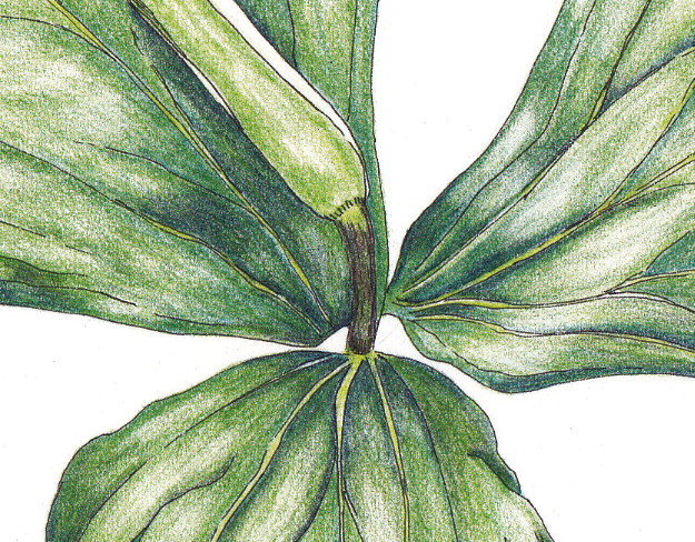
Here is a scan (not just a photo as I had posted before) of the final version of the trillium in ink and colored pencil:


I continued to work on the shading and dark areas with dark indigo, but most of what I did was "paint" with my kneaded eraser by lifting out areas of color where there are highlights and then doing a tiny bit of blending after that.

Here is a detail shot of the center (per Irene's request!) :) I am embarrassed at how much clean-up I need to do around the edges!! However, it is helpful indeed to see a close-up.


I really like how it turned out. Is it perfect? No, but it feels "done" to me. I don't want to compare it exactly to the reference photo, but rather just look at it on it's own merit. I know from past experience that I will set it aside and catch a glimpse of it later and continue to be very pleased with the end result.

I have a second reference photo and line drawing in ink of another trillium - this time with an open blossom. So, that will be next on my list!

What do you have on your drawing table or workbench this week?

Tuesday, March 6, 2012

Update - Trillium Almost Done!

I have been working more on the trillium and am getting closer! 


This is what it looked like yesterday (above), as I continued to add layers of color on all three leaves.


And this is what it looks like today, after additional layering, mostly the olive green. I added dark indigo (9201-157) to the mix to deepen the shadow areas and still need to blend those in more as well as darken more, especially on the leaf on the far right. 

As I have read in many instruction books, using a dark blue/indigo or sepia is a better way to deepen shadow areas as it provides depth and doesn't make it as flat or stark as black.

I need to set it aside and look at it with fresh eyes later or tomorrow, pull out some highlights and further darken shadow areas, then make sure the blending works overall.

This is the part that I find most difficult and most rewarding. If it continues to come together and I can 'see the end' then it gets exciting. However, often at this stage, I find that I blend too much and it gets overworked.

What do you find to be the most difficult part of a painting or drawing?

Saturday, March 3, 2012

Making Progress - Trillium in Ink and Colored Pencil


I am making a bit of progress on the trillium (Trillium grandiflorum). I have continued to layer the permanent green olive (#9201-167) over the darker deep cobalt green (#9201-158) layer. 


I will continue to layer until I get all three leaves colored. Then I will work on refining the shading, deepening shadows, lifting out highlights, etc. Stay tuned!  

What are you working on these days?


Related Posts Plugin for WordPress, Blogger...